Building a compelling and cohesive colour palette is crucial for any fashion brand. The right colours can evoke emotions, convey your brand's personality, and attract your target audience.
Colour is one of the key ways in which you can build up a brand identity. In this article we’re going to explain our step-by-step guide to help you develop a strong colour palette that builds a clothing range that is visually appealing as a collection and represents your brand.
First off, let’s explore a few examples of successful brands that have utilised distinctive colour palettes to help make them recognisable and build up a strong brand identity.
How Top Fashion Brands Build Their Signature Colour Palettes
Fear Of God Essentials
Fear Of God Essentials employ a minimalist colour palette with neutral tones like beige, black, and white. This choice creates a timeless and versatile look that appeals to a wide audience. The simplicity and sophistication of these colours align with the brand's ethos of understated luxury.

Joah Brown
Joah Brown favours a range of cool tones, from soft greys and blues to deeper shades of green and black. This palette creates a relaxed, laid-back vibe that is perfect for their line of comfortable yet stylish loungewear. The cool tones contribute to the brand's image of effortless chic.

Represent
Represent is a British streetwear brand known for its edgy and contemporary designs. Their colour palette often includes darker, moody tones like black, charcoal, and deep navy, accented with occasional pops of vibrant colours that add interest and keep the palette from feeling too monotonous. The palette should align with the brand’s aesthetic and target audience – in Represent’s case, the urban and fashion-forward crowd.

Step-by-Step Guide: Creating a Colour Palette for Your Clothing Line
1. Define Your Brand Identity Before Choosing Colours
Before diving into colour choices for your brand, it's essential to have a clear understanding of your brand identity. Ask yourself:
- Who is your target audience?
- What emotions do you want to evoke?
- What is the story behind your brand?
Your brand’s target market, values, and story will heavily influence your colour choices. For example, a brand targeting a younger, vibrant audience may opt for bold, bright colours, while a luxury brand may prefer muted, sophisticated hues.
2. Use Colour Psychology to Evoke the Right Brand Emotion
Colours have psychological effects that can influence how consumers feel about your brand. Here’s a brief overview of common colour associations:
- Red: Energy, passion, and excitement.
- Blue: Trust, calm, and professionalism.
- Yellow: Happiness, optimism, and warmth.
- Green: Nature, growth, and tranquility.
- Black: Sophistication, elegance, and power.
- White: Purity, simplicity, and cleanliness.
Understanding these associations can help you select colours that align with the emotions you want your brand to convey.

Colour theory wheel, from https://witanddelight.com/2020/07/a-color-skeptics-guide-to-color-theory-in-design/ 24th June 2024
3. Leverage Colour-Theory Tools to Craft Balanced Colour Schemes
Use digital tools like Adobe Color, Coolors, or Canva to experiment with different colour schemes. These tools allow you to explore different colour combinations and find those that work well together. Pay attention to concepts like complementary, analogous, and triadic colour schemes to ensure a balanced palette.
Analogous Colours: These are colours next to each other on the colour wheel (e.g., blue, blue-green, and green). They create a harmonious and cohesive look.
Complementary Colours: These are opposite each other on the colour wheel (e.g., red and green, blue and orange). They create a vibrant and high-contrast effect.
Triadic Colours: These are evenly spaced around the colour wheel (e.g., red, yellow, and blue). They offer a balanced and dynamic palette.
4. Align Your Colour Palette With Seasonal & Collection Timing
Consider when your collection will launch as this may influence your colour choices for more seasonal items.
You might want to incorporate more seasonal colours such as brighter, lighter colours for spring/summer, or deeper, richer tones for autumn/winter. Bear in mind that most brands design AT LEAST six months ahead of collection launch due to industry lead times, so think ahead when you’re designing and selecting colours. Here's a useful blog post about when to start designing for a Spring/Summer launch (if you're launching in A/W, just change the dates - the timescales are still valid!).
You might also want to consider trends; fashion is an ever-evolving industry, and staying up-to-date with current trends can help keep your designs relevant and desirable. Research colour trends by looking at fashion shows, industry reports, and popular fashion blogs. However, whilst trends are important, it’s crucial to balance them with timeless colours to ensure longevity in your designs.
5. Build a Core Palette: Neutrals, Core Colours & Accent Shades

Start by selecting a few core colours that will form the foundation of your palette. These are the primary colours that will appear most frequently in your collection. Typically, a core palette includes:
Neutrals:
Neutrals like black, white, grey, and beige serve as a solid foundation. They are versatile and timeless, ensuring that your pieces can mix and match easily.
Core Colours:
Choose 2-3 core colours that represent your brand's identity. These colours should be prominent in your designs and marketing materials.
Accent Colours:
Use accent colours sparingly to add interest and contrast. These can be seasonal or trend-based, allowing your brand to stay fresh and relevant.
Now you should have a ‘colour story’ for your collection. Ensure the shades harmonise well together and convey the theme or mood of the collection. You don’t need to stick to the same colours for every collection drop, but you should start to build up a brand identity by selecting complimentary colours. It could be really jarring for your customers, for example, if you go from soft pastel tones to primary brights.
6. Choose Warm or Cool Undertones for a Harmonised Collection
Once you’ve established the core colours for your clothing brand, it’s time to consider undertones. An undertone is generally ‘warm’ or ‘cool’, and this refers to the amount of a certain pigment in that colours make up. To simplify, generally warm tones have more yellow in them and cool tones have more blue in them. To create a harmonious colour palette, you want to make sure your shades are sitting together in the right undertone family!
Let's use grey as an example. You might be thinking, grey is grey! – it’s a very neutral colour. But there are LOTS of different grey shades. See the visual below; the greys at the top have cool undertones, meaning they have more blue in them. These would compliment colours such as light pinks, purples, mint greens, deep blues.

The bottom row of greys have warm undertones, meaning they have more yellow in them. These would be most suited to go alongside colour shades that also have warm undertones, such as chocolate browns, deep oranges, reds, olive greens, sandy beiges.
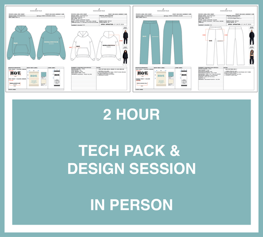
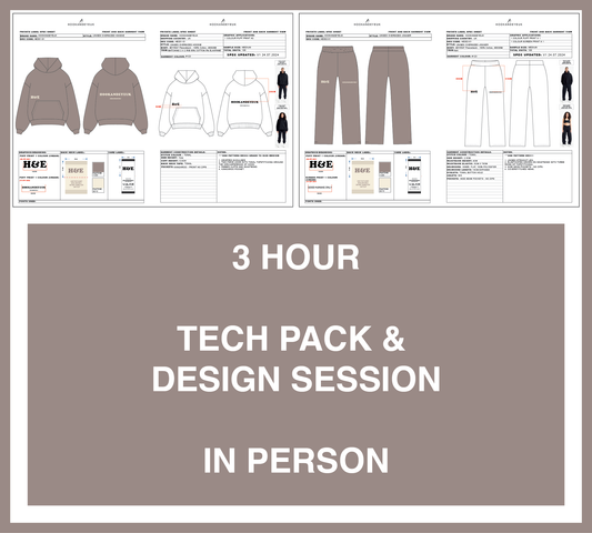
It's particularly important when you're selecting fabrics for your clothing that the colours compliment each other - a t-shirt fabric would be different to a sweatshirt fabric, so you would ideally want to choose shades that have the same undertone so they compliment each other. (Don't worry if this sounds daunting, at Hook and Eye UK our designers will always help you with selecting complimenting colours and comparing fabrics in your tech pack and design session!).
Conclusion: Final Tips to Finalise Your Clothing Color Palette
Creating the perfect colour palette for your clothing range is a key step in building a strong and recognisable brand identity, so it's worth investing the time to get it right!
The colours you choose not only reflect your brand's personality but also resonate emotionally with your target audience, helping to create a lasting impression for your brand. Maintaining a consistent palette reinforces brand identity and makes your brand more easily recognisable.
When building your own colour palette, start by understanding your brand identity and the emotions you're looking to evoke; colours are one of the first things customers notice, so make them count! Consider factors such as the timing of your collection drop to ensure your collection is seasonally appropriate and desirable.
Begin with a core palette of neutrals and key brand colours, and enhance it with accent colours for interest. Pay attention to warm and cool undertones to ensure your shades harmonise well together, creating a visually pleasing and cohesive look.
By following these steps, you'll develop a colour palette that not only enhances the visual appeal of your clothing range but also strengthens your brand's identity, ensuring that your designs are both memorable and impactful.
At Hook and Eye UK we always help you discuss colours and advise on what tones work best together when selecting fabric colours in our tech pack & design sessions (to find out more about tech pack & design sessions, click here).
Love, Bethany H&E xx
P.s We're here for you if you have questions head to our contact page here.

About the Author: Bethany is an experienced fashion designer at Hook and Eye UK, with a First-Class BA (Hons) degree in Fashion from the University of Northampton. She is the recipient of both the Fashanne East Midlands Design Award and the CORDURA Durable Design Award, recognising excellence in design and durability. Bethany began her career as a Design Assistant within the uniform industry, contributing to ranges for major brands including HSBC, EasyJet and Costa Coffee. She later worked as an Accessories Designer, creating licensed products for leading UK retailers such as Next, M&S and New Look. She joined Hook and Eye UK in November 2023.