Luxury logos don’t rely on complexity or trends. Instead, they communicate confidence, restraint, and craftsmanship through carefully considered design choices. The most successful luxury brands are instantly recognisable not because they do more, but because they do less, with precision.
So what actually gives a logo that luxury feel? Below are the core principles that separate timeless, premium branding from designs that feel temporary or overworked.
1. Simplicity That Feels Intentional
Luxury logos are almost always minimal, but never accidental. Every line, letter, and space is deliberate.
This simplicity signals confidence. Premium brands don’t need visual noise to demand attention; they trust recognition to do the work. Clean marks feel established, calm, and self-assured. Think of brands like Chanel or Saint Laurent, their logos are understated, yet unmistakable.
In luxury branding, restraint is a strength. If something can be removed without losing meaning, it usually should be.
2. Balanced, Elegant Typography
Typography is often the defining feature of a luxury logo. Rather than relying on decorative elements, premium brands let the letterforms speak for themselves.
Luxury typography typically features:
- Strong contrast between thick and thin strokes
- Elegant serif details or clean, geometric sans-serifs
- Generous spacing that allows the logo to breathe
- Carefully proportioned letterforms
Custom typography plays an important role here. When a brand uses bespoke lettering, it immediately feels more exclusive because no one else can replicate it.
At Hook and Eye UK, our typography is intentionally clean and concise. It reflects professionalism, clarity, and correctness, values that are essential in clothing design and manufacturing, where precision matters.
3. Timeless, Confident Colour Choices
Luxury brands avoid trend-driven colour palettes. Instead, they rely on tones that feel grounded, stable, and enduring.
Common luxury colour choices include:
- Black – authority, sophistication, strength
- White – clarity, purity, minimalism
- Gold – heritage, prestige, timeless value
- Deep tones like navy, forest green, burgundy or charcoal – craftsmanship and depth
These colours age well. They don’t rely on novelty, and they rarely need updating, which is exactly what makes them feel premium.
4. Use of Negative Space
Space is one of the most powerful tools in luxury design.
Rather than filling every area, high-end logos use negative space to create:
- A calm, uncluttered aesthetic
- Visual hierarchy and balance
- A sense of confidence and control
Luxury brands understand that space itself communicates value. It suggests clarity, patience, and refinement.
The Hook and Eye UK logo reflects this philosophy. Our mark is presented in classic black typography on a white background, paired with our needle-and-thread symbol above, surrounded by generous negative space. This gives the logo presence without excess.
5. Subtle, Iconic Symbols
When luxury logos include symbols, they are rarely illustrative or complex. Instead, they are reduced to their most recognisable form.
Luxury symbols are usually:
- Simple and geometric
- Monogram-based or abstract
- Instantly recognisable at small and large scales
Brands such as Louis Vuitton or Gucci rely on refined monograms rather than detailed imagery. This allows the logo to work across packaging, garments, labels, and digital platforms without losing impact.
6. Precision in Line Work and Proportion
Luxury logos feel “right” because their proportions have been carefully considered.
They typically feature:
- Clean, consistent line weights
- Symmetry or near-symmetry
- Balanced spacing
- Smooth, controlled curves
There’s no randomness in a luxury logo. Every detail reflects the same level of craftsmanship that the brand claims to offer in its products.
7. A Meaningful Story Behind the Design
True luxury is never just visual, it’s rooted in meaning.
The strongest luxury logos are connected to:
- Brand heritage
- Craft traditions
- Founder story
- Industry symbolism
- Core brand values
When a logo has a story, it feels more intentional and more enduring.
The Hook and Eye UK logo features a needle and thread symbol above the wordmark. This is a nod to a time when garments were handmade with care and attention. It also represents a more thoughtful, considered approach to modern clothing manufacturing; one that values longevity, skill, and responsibility.
Conclusion: Luxury Lives in the Details
A luxury logo doesn’t rely on excess or decoration. It relies on precision, balance, and restraint. Through typography, colour, spacing, symbolism, and proportion, it communicates quality long before a customer touches the product.
Luxury branding is not about doing more; it’s about doing everything right.
How Hook and Eye UK Can Help
At Hook and Eye UK, we support brands looking to build refined, timeless identities. We can:
- Review your existing logo
- Suggest luxury-focused design improvements
- Create clean, text-based or symbol-led logos
- Develop branding that aligns with high-end garment production
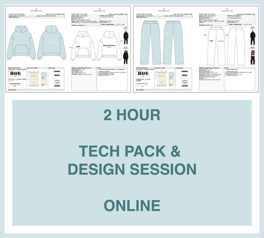
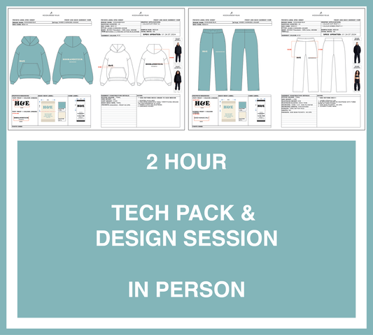
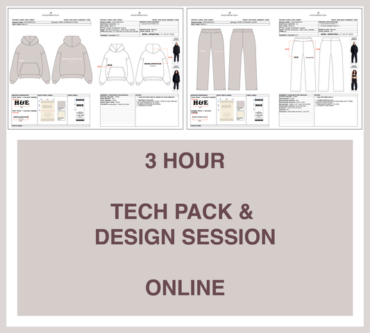
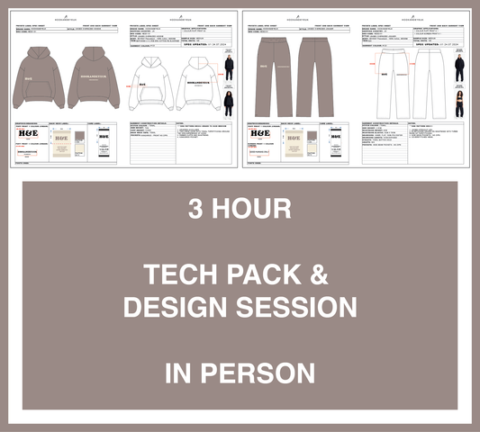
We also offer Tech Pack and Design Sessions, allowing you to develop your logo, branding, and full production-ready tech packs together, ensuring your visual identity and garments are aligned from the very beginning.
Book a Design or Tech Pack Session with Hook and Eye UK and create a brand identity that feels considered, confident, and built to last.
Hope you found this helpful,
H&E team :)

About the Author: Jocelyn Evans, owner of Hook and Eye UK, studied Fashion Design and Technology at Manchester Metropolitan University, including a year-long internship designing for Puma’s Team Sport division. After graduating, she worked with emerging grassroots brands in Birmingham and, in 2013, built a UK in-house design, sampling and manufacturing service that evolved into H&E. Recognising the limits of UK production, she expanded the business by pairing her UK team’s design, pattern cutting and sample expertise with overseas partners offering advanced fabric and construction technologies. Committed to transparency, sustainability and craftsmanship, Jocelyn creates only premium, long-lasting clothing—never fast fashion.